
Don’t judge a book by its cover.
We hear that all the time, but the truth of it is that covers *do* matter. Like it or not, many readers often use covers to determine the “quality” of a book, even if what’s on the outside isn’t indicative of the inside. I know when I browse bookstores, my eye is usually drawn to particular types of covers, and on a shelf with hundreds of potential stories, I’m going to go to the ones that attract my attention first.
Not that it’s always a match.
I’m sure we’ve all found books with fabulous covers that were dogs inside…and discovered gems with lousy covers. Given the sheer number of books and eBooks out there, I do think that we tend to gauge the professionalism of a book by the care given to the outer shell.
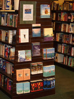
This is probably particularly true in the self-published realm. You see a lot of advice given about editing, but it’s also fairly common to see requests to not skimp on the cover.
So what makes a good cover? What makes a bad cover?
The thing is, with some obvious exceptions, it’s hard to really tell. What one person finds appealing, another may not. What publishers are trying to bank on is finding a cover that will appeal to the largest range of potential buyers.
Which is great – but that’s when we start seeing trends. When I look over my bookshelves, I can almost immediately pick out which fantasy books were from the late 80’s – simply due to the style of the images, and the fact that they’re all done by 2 or 3 artists who were fairly popular back in the day. (Lots of dragons and scantily clad women, of course.) Or bodice ripper romances graced with manly men and women falling out of their clothes? (And random animals in the background and huge swirly fonts proclaiming Scarlet Something, or Heated Whatever.)
Take Urban Fantasy today – how many covers have kick-ass women in leather? Or shirtless men with abs of steel for Paranormal Romance? (and how many covers have we seen lately where it’s not even an entire person? Just an abdomen, glistening in the moonlight?)
And then there’s sometimes a bit of reader backlash. (And sometimes mockery. Just check out WTFbadromancecovers.tumblr.com if you want to see what I mean.)
They want something different, but how can they find that different book when they all start to look the same? And if I had to ask you, what cover have you seen in the last few years that instantly became a trendsetter? That you would recognize on sight?
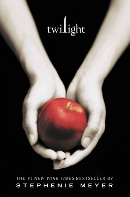 For me, there are very few. Maybe Twilight, which I’ve never read, but the minimalist color scheme and stark background make for immediate recognition. (And a fair number of copycats afterward.)
It becomes a fine line, really. We want readers to know what sort of book they’re picking up because it makes it easier for them to choose what to read – I’d expect something sexy for an erotic romance, for example. But we also want to have them stand on their own. (God, it’s almost like high school, isn’t it? “Be yourself…but don’t be so different that no one will have anything to do with you!”)
So what are your favorite covers? Most hated covers? What is it about a cover that leads you to buy or read a book? Do covers matter at all?
Note about the blogger (from Danielle!): Allison's second novel in her Abby Sinclair series, A Sliver of Shadow, hits shelves Tuesday, February 28th! The sequel to A Brush of Darkness, it's highly recommended! (You can also read the first chapter excerpt HERE.)

Comment on this post for a chance to receive a set of Abby Sinclair novel bookmarks..and a copy of the new release!
The recipient will be picked at random one week from today--Friday, February 17, at 3 p.m.!